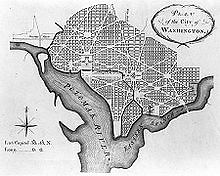
 Sometimes I wonder what Pierre Charles L'Enfant's city plan for D.C. would look like if Flickr had existed in 1792. Who doesn't, right? But I can sleep easy tonight, because Eric Fischer has reimagined it for me.
Because I'm not quite tech-savvy enough to understand how Fischer came up with this project, I'll let Flickr blog describe it for me:
"Using geo-tagging tools, his imagination and some fancy Perl scripts, Eric is plotting Flickr photos on a map and highlighting 50 major cities in a vector view... The different colors represent different modes of transportation: Black is walking (less than 7mph), Red is bicycling or equivalent speed (less than 19mph), Blue is motor vehicles on normal roads (less than 43mph); Green is freeways or rapid transit."
 More importantly, it looks cool. And more pragmatically, you get to see where the masses are spending their time and whipping out their camera phones so you can try to avoid them. Obviously the tourist-centric areas of D.C. are the most heavily trafficked and darkly shaded.
So if you want to break the mold like Fischer has, head to one of his map's less discovered regions and do some nifty documenting of your own. You can use L'Enfant's original masterwork (right) as a guide. Some classics don't go out of style.
Via FuckYeahDC. Check out other city vectors here.


.jpg)
.jpg)


.jpg)
.jpg)
.jpg)


