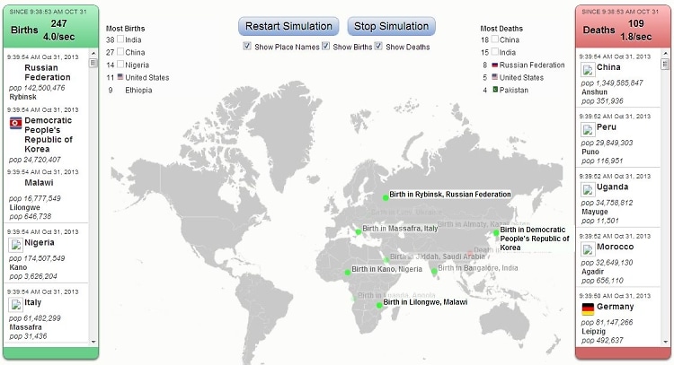
A Real-Time Map of Births and Deaths
With the U.S. population on track to increase by 44% by 2050, Brad Lyon and Bill Snebold decided to create an interactive simulation map of births and deaths around the world, following their popular U.S. interactive map. Lyon explains,
"This one for world births/deaths is certainly more overwhelming than the one for the U.S., and the rate at which they must be occurring gives another glimpse into how big the world is."
[
The Atlantic]
It's really riveting to watch.
 [Photo via]