What’s the story behind your logo and can design?
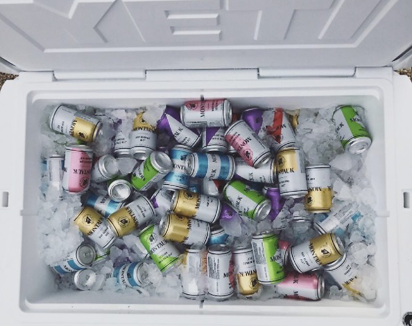
We invested in branding and worked with an agency in the city to design the cans.
They came with a team to Montauk and stayed for few days, interviewing locals, taking in the vibe. They came back a few weeks later and pinned up several concepts on the wall in the taproom. Everyone pointed at the same one at the same time, the yellow X.
Simple, clean, nautical style with color coding for each brand. It works perfectly for what we were going for.

.jpg)
.jpg)

.jpg)
.jpg)
.jpg)
