One of the really unique things about the Mag is the style of advertisements. They definitely don't look like regular old print ads. Any reasoning behind that?
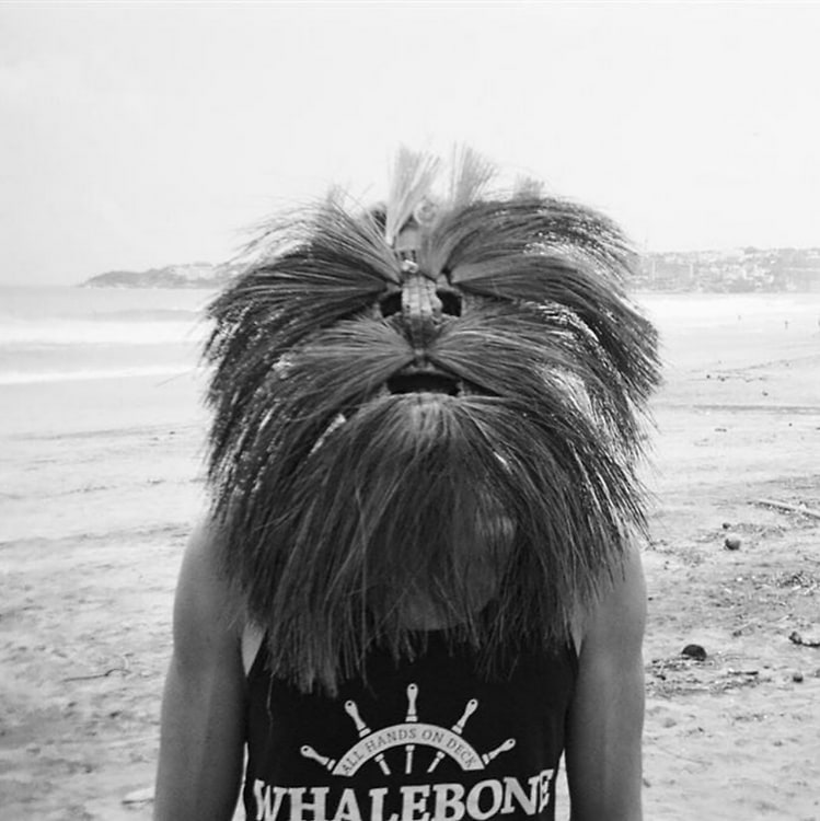
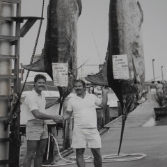
That was perhaps the biggest discussion in that basement. How do we get over the "you buy a page, send us your ad, and we plop it on that page, next to an article that has nothing to do with it" practice that for some reason became the norm in the publishing world. We by no means wanted to make everything advertorial and "trick" people, but we knew there had to be a better way. So with Taylor and our Art Director Mallory Turner, we developed a workflow where clients send us their assets and we turn around an ad that engages the reader, flows with the content, and most importantly really elevates that brand to an audience it never before had reached. Yes it may be a bit more expensive, but it is a no brainer for clients who maybe had a tired brand or not enough capital to invest in an entire rebrand. And it works best for our readers we think. The ultimate goal.

.jpg)
.jpg)

.jpg)
.jpg)
.jpg)
