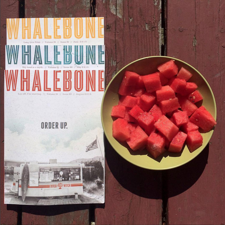
We love the magazine - read it cover to cover. It has such a great, quality feel to it. Why the decision to do print? What were your thought processes like on the design?
Print is the shit. Yes we all stare at our phones constantly but there's nothing like a well printed piece of literature/magazine/anything. I think Eddie (our Publisher) and I spent half a day in a Barnes and Noble rubbing magazine covers until we found what we wanted and took it to the printer. Touch and feel is everything. There's just something timeless about feeling the grit of a good magazine, and wanting to keep it with you, not just toss it back on the rack. To move it even further, we wanted to make a magazine that engaged with readers who may not be into that sort of thing. While I'm a boring Medium fan, most people just like concise and engaging content that is well designed. Usually this is on web and we tried to transfer that style to print.


.jpg)
.jpg)


.jpg)
.jpg)
.jpg)
