The branding is so fun - reading the back of the boxes feels like having a conversation with a friend. Did you set out to make the brand approachable rather than clinical?
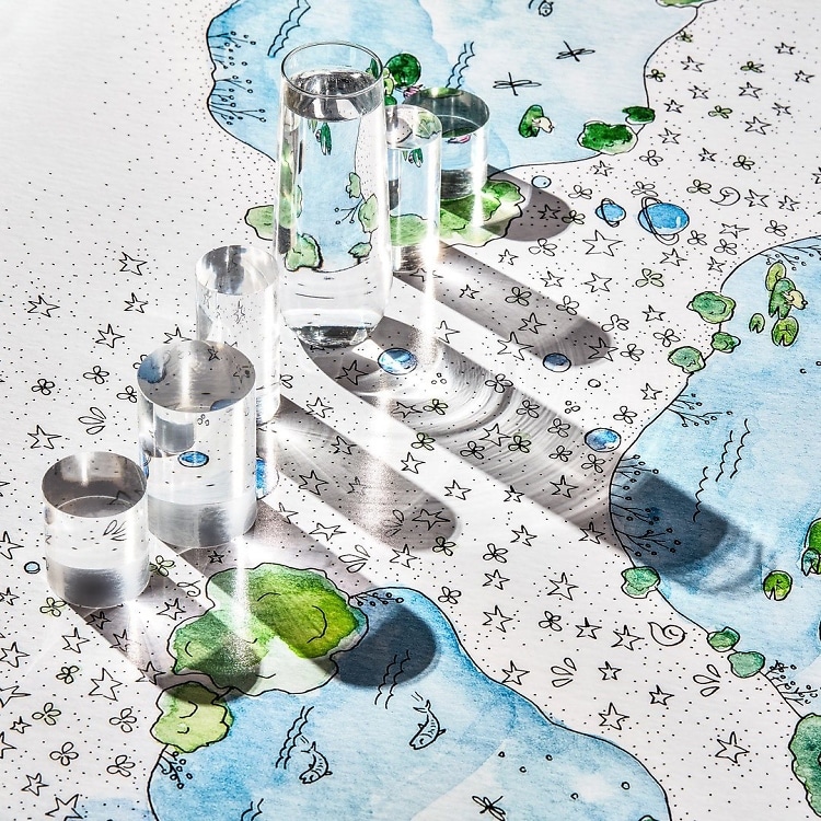
I wanted every touch point to be a story-telling opportunity. I knew I wanted to play with color because that suits my enthusiastic personality. I also decided early on that the brand should use watercolor as the design because it synchronized with the frog theme and product names, which are named after lakes. I found an artist on Instagram whose work I felt completely drawn to. I had never purchased art for my apartment, nor did I follow artists on Instagram, so an “artsy” person I was not. After finding her IG page, it was the first time in my life that artwork spoke to me. Her Instagram handle became my inspiration board and rather than finding a graphic designer to mimic her work, I went straight to the source!
As a publicist, the one area I knew like the back of my hand was copywriting. I knew every writer in the industry and there were a few whose work I had been following for a number of years. They all had that conversational tongue I wanted for the brand; I wanted the customer to feel like we were speaking with them and not at them. Working with copywriters was a blast for me. I would essentially type up pages of notes for each part of the brand (website, packaging, collateral) and then say: “Okay now put it in your tone!” I now work with just one writer who I literally fan-girl over. She can make me fall out of my chair from laughter over a writeup about red lipstick.

.jpg)
.jpg)
.jpg)
.jpg)
.jpg)
